Spenderrific is a Kenyan lifestyle publisher covering travel, cuisine, pet care, and personal finance under the tagline "Know When and Where to Spend." The publication has been running as an article site since 2015, and launched its monthly digital magazine in February 2024. Live at spenderrific.com, the platform we built for them replaces the older site and brings both the article library and the magazine into one place, with an editor-friendly admin behind it so the team can publish everything themselves.
Ten years of published articles were already sitting on the older site, and the newer magazine arm had been running since February 2024. The two content forms lived in separate places and had no way of talking to each other. A reader who found an article about eco-friendly fashion through Google could not tell that the same topic ran as a feature in the latest issue. A reader flipping through that issue had no way to tap on a spread and jump into the related article for more detail.
The team also had no way to publish issues themselves. Every magazine update meant going back to a designer, waiting for a fresh export, and having someone else upload it somewhere the editors did not control. Spenderrific needed one place where the ten years of articles and the newer magazine felt like the same thing, and where the editorial team could run the whole operation without waiting on a developer.
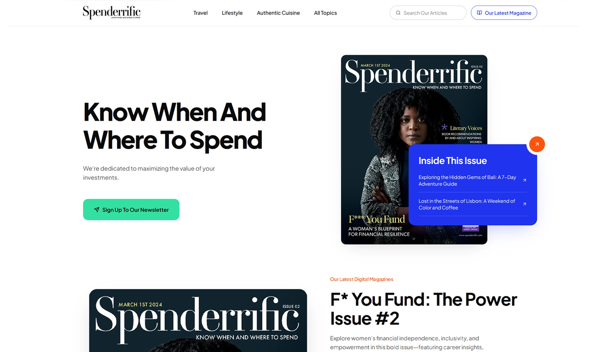
We designed and built the platform in-house. The interesting part is the magazine reader. Instead of a plain PDF download, each issue opens as a flippable spread that readers browse page by page in the browser. Every page can carry clickable hotspots the editorial team draws themselves in the admin, and each hotspot links to either an article on the site or an outside link the editor chooses. A single spread becomes a doorway into the wider library.
Here is what we built in the first release:
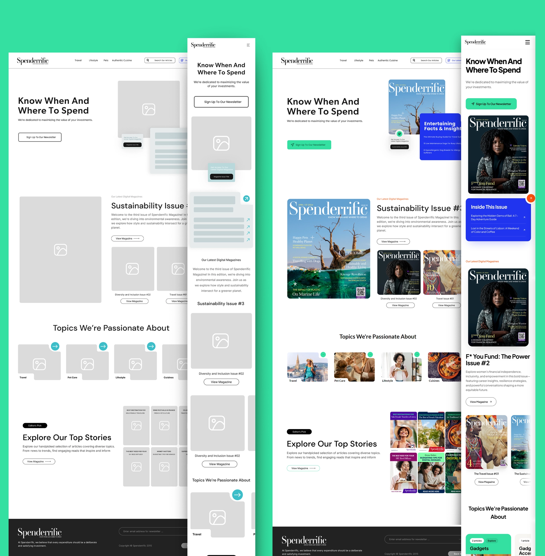
The design work was ours from the ground up. Low-fidelity wireframes first, then high-fidelity mockups in Figma, then the frontend built to match. We worked with the editorial team's existing print identity, so the digital platform reads as a continuation of the magazine rather than a separate product. Fonts, spacing, and the feel of the admin all pull from the same visual language the print issues already use.
"The hard part was not the article publishing. It was making a magazine feel like a living, clickable object without losing what makes it feel like a magazine. The hotspot layer is what tied it together. Editors draw a rectangle on the page, pick an article from a dropdown, and now that spread has a way in and a way out."The Baobab Collective Team
Spenderrific launched in June 2026 at spenderrific.com. Ten years of articles were carried over into the new platform (142 published across 12 topics), three magazine issues went live at launch (Travel, Power, and Sustainability), and the editorial team now runs the whole operation from the admin without any developer involvement.
The team can upload a new issue, draw hotspots linking each spread to the relevant articles, set a cover, publish, and feature it on the homepage. Every step lives inside the admin. Readers get a magazine that behaves like a magazine and a website that behaves like a website, and both point at each other so nothing feels stranded.
Bespoke editorial platforms with the tooling your team actually needs. Let us scope yours.
Start Your Project